
Jump to Docs Navigation
Back in the day I was a fan of the “Trebuchet MS” font. I didn’t like it large, but set fairly small I loved the look of it. Looked very website-ish — if that makes sense.

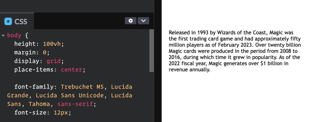
Honestly, at 12px, it still looks really nice.
The main reason I would use it is that it was considered a “web-safe” font, meaning most computers had “Trebuchet MS” installed and it would look more or less the same across those computers. On my latest-version macOS, I’ve still got it as a pre-installed system font.

I was thinking about this as Oliver Schöndorfer blogged about it recently. He points out that mobile operating systems changed the math on what is actually “web safe”.
Web-safe fonts system fonts that are pre-installed on most browsers and operating systems. While this was true 15 years ago, when you would find Arial, Times New Roman, Georgia or Verdana on Windows and Apple machines, this drastically changed with the mobile era.
Apparently none of the classic web-safe fonts are actually “web safe” anymore, which I suppose is ironic and kinda funny. I think designers have gotten more used to and OK with some differences in typography across browsers. Modern Font Stacks is a great resource for that. The whole point of a font stack is being cool with the actually used font being whichever one hits first in that list. The whole idea of system-ui is like a font stack in a keyword by itself, and particularly well suited to very “app like” websites that are helped by looking like the operating system they are being used on. Maybe the new web safe is just typography that works fine wherever. Or maybe that’s what it always meant.
Along those lines, I think uifonts.app is a clever idea of looking at fonts in a very practical “app like” way. I like looking at beautiful typeface type specimens as much as the next fella but in the end it matters more what the typeface looks like on my boring thing not your fancy thing.

system-ui as an option!Quick hits:
- It’s a modern miracle you can drop an image of typography onto a tool and it’ll tell you what fonts are used.
- One of the greatest experiments (that turns out to be perfectly viable) is building syntax highlighting into fonts themselves. Font foundries really need to get on this. Will buy.
- Elliot Jay Stocks recently shared this arranged alphabet and it rules.
- I’ve always shied away from
-webkit-font-smoothing: antialiased;but David Bushell almost has me convinced otherwise as 1) it’s macOS (very literally only) 2) it can make rendered fonts look closer to other operating systems, that is, thinner. My holdup is that I generally like thicker and it will be more consistent for users on that OS. But David is convinced enough to put it in reset stylesheets, so have a think for yourself.
And some more visuals!


