Looker Studio helps you transform data into an image. As a free, browser-based tool, all you need to use Looker Studio is a Google account, a data source and the desire to create a data visualization.
Jump to:
What is Looker Studio?
Looker Studio is a powerful free data visualization tool that simplifies the process of creating interactive charts and dashboards with data from hundreds of connected sources. Customers who need additional enterprise management and collaboration features might upgrade to Looker Studio Pro, which is available as a paid service.
Looker Studio and Looker Studio Pro are Google’s entries in the data visualization market that includes competitors such as Tableau from Salesforce and Power BI from Microsoft.
What happened to Google Data Studio?
Looker Studio is the new name for what used to be called Google Data Studio. In October 2022, Google rebranded its various business intelligence offerings with the Looker name. Google acquired Data Studio in 2020.
Looker Studio has nearly all of the capabilities as Google Data Studio. The product remains free to use and represents a rebranding by Google.
What can you do with Looker Studio?
Looker Studio can handle huge quantities of data and produce compelling charts, but a well-crafted chart requires both accurate data and an appropriate chart type. Inaccurate data won’t produce a chart that shows the truth no matter how you display it. And good data put into a poorly chosen chart type can confuse people.
SEE: Take advantage of this big data policy from TechRepublic Premium.
For most people, a picture conveys meaning in a way that raw data doesn’t. In a business, for example, you might use it to analyze sales, costs or survey data. A website manager might use Looker Studio to help understand site visitor behavior, purchase patterns or ad performance. A social media manager could use Looker Studio to show reach, engagement or conversions.
With reliable data displayed in a meaningful chart, Looker Studio takes things further and offers interactive controls as well as several distinct share methods. Controls let people change various chart content, so a viewer might filter out certain fields or narrow the chart to display data in a selected date range. Not only can you collaborate on Looker Studio reports, much as you might collaborate in a Google Sheet, but you can also schedule reports to be regularly emailed to people.
How to get started with Looker Studio
To get started with Looker Studio, open https://lookerstudio.google.com in your browser. Then, follow the process below to connect a data source, create a chart, refine the display, optionally add interactive control and then share your report.
1. Connect to data
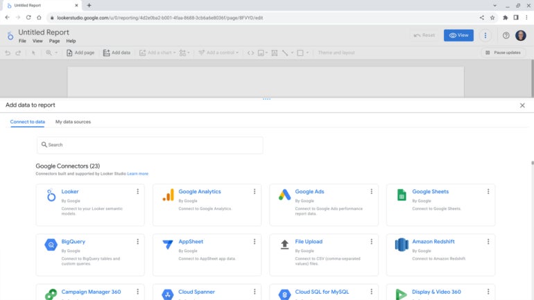
First, you need data. In Looker Studio, when you select Create | Report, the system prompts you to select a data source (Figure A). You may choose to add data with any of the more than 20 Google-provided Connectors, which include sources such as Google Analytics, Google Sheets, BigQuery, YouTube Analytics, Tables by Area 120, Microsoft SQL Server, MySQL and a .csv file you upload.
Figure A

You might also select any of the more than 630 Partner Connectors to add data sources that range from app, advertising, social media and website analytics to accounting, customer relationship management, real estate and time tracking. After you choose a connector, you may need to sign in to the source then select the specific dataset you desire.
Whichever data source you choose, make sure the underlying data is as reliable as possible. For example, when you connect a Google Sheet that contains data, you might review at least a few screens of data fields to understand the range of data in various fields. For numeric data, you might sort a column to review the low and high numbers to identify data that might be out-of-range and may need to be reviewed and then adjusted or discarded. Reliable data is required in order to create an accurate chart.
2. Choose a chart type
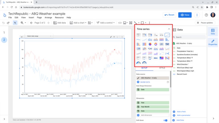
Next, select a chart type to display the data. The more than 35 types include tables, time series, bar, column, line, area, pie, donut, scatter, bubble, pivot tables, scorecard, treemap, gauge and maps (Figure B). After you select a chart type, you may drag and drop data fields from the right side of the screen to the area below the chart title, then customize and configure options and sliders as desired.
Figure B

Consider the data and the message you wish to convey when you select a chart type. Does the chart type emphasize your intent without explanation? If a person unfamiliar with your intent views the chart, will they understand your intent? Don’t try to make a chart accomplish multiple messages. Instead, try to convey a single concept with a chart — and convey it with the simplest chart possible.
3. Refine the display
While Looker Studio offers a highly usable set of themes and default design choices, in many cases a few refinements might help reinforce both the content and intent of your chart. In addition to labels and chart grid lines, you may add an image, text, lines or shapes and adjust the chart fonts, text colors, background and borders.
As you adjust items, you might make changes that reinforce understanding of the data. For example, in the chart that displays both maximum and minimum temperatures, I changed the line colors to red and blue respectively (Figure C). These refer to the common cultural association in the U.S. of the color red with hot and the color blue with cold.
Figure C

4. Add controls
Looker Studio lets you place controls, which allow people who access your page to adjust settings. This adds an interactive element that helps people filter and experiment with various settings, which, one might hope will lead to better understanding of the data and chart content.
Available controls include a dropdown list, slider, checkbox and date range (Figure D). Each of these may be placed anywhere on the page, but make sure your placement of a control doesn’t obscure your chart. Remember, when selections change, various chart elements will change.
Figure D

5. Share with others
Just as you may collaborate with people on a Google Docs document, you may add people to collaborate on Looker Studio charts (Figure E). Select File | Share, then add email addresses and choose whether to give people Viewer or Editor access.
Figure E

The File menu also offers options to download a report or obtain an embed code, which lets you embed Looker Studio charts elsewhere on the web, such as on a Google Site.
What’s your experience with Looker Studio?
If you use Looker Studio, what chart types do you use most often? What data do your Looker Studio reports depict? If you include controls, what types of filters or adjustments do people who interact with your charts find most helpful? Have you tried using Looker Studio to send scheduled reports to people via email? Mention or message me on Twitter (@awolber) to let me know how you use Looker Studio.


